Anatomy and color theory may have their place in the artistic process, but there’s one step that far too many artists don’t devote the time to mastering… photographing their art.
If you’re drawing or painting with traditional mediums, photographing your art is a critical final step before it’s sold, stored or shared.
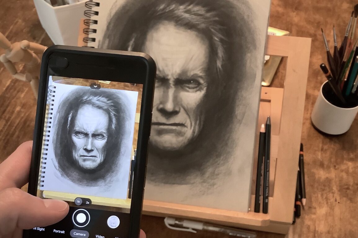
While flatbed scanners have traditionally offered the highest image resolution, they can’t hold a candle to the convenience of a smartphone. In this post, we’ll outline some simple steps you can take to help your art photos look their best.
No special apps are required beyond the default photo adjustments available on Android and iOS.
1. Find a good light source
The first step you’ll want to take towards photographing art (or anything for that matter) is finding a good source of light. Ideally, this means a bright ambient light, preferably from a natural source like a window.
The entire page should be evenly lit and there shouldn’t be any cast shadows (including your own!). If the light is too focused, like from a lamp, you can end up with one side darker than the other. If you can’t use daylight, try to make sure there are at least multiple lights on throughout the room.
The light source you use can effect the color balance of your image, which we’ll correct later on.
Another tip – Don’t use direct flash.
It can be tempting to turn your phone’s flash on to make the art appear as bright as possible. This usually doesn’t work out too well. Mediums like graphite, ink and paint can reflect strong light, which results in glares in the photo.
2. Avoid skewing the perspective
One of the reasons that photographs of art never seem to look as good as the real thing is because of the angle the photo was taken. If the camera is slightly above or below the page, it can skew the photo and make everything feel “off”.
This is also true if the camera is too close to the page, which can distort the perspective.
You’ll want to make sure your paper or canvas line up with the edges of your phone screen as much as possible. The easiest way to accomplish this is to turn on the grid setting on your phone’s camera.
3. Crop symmetrically
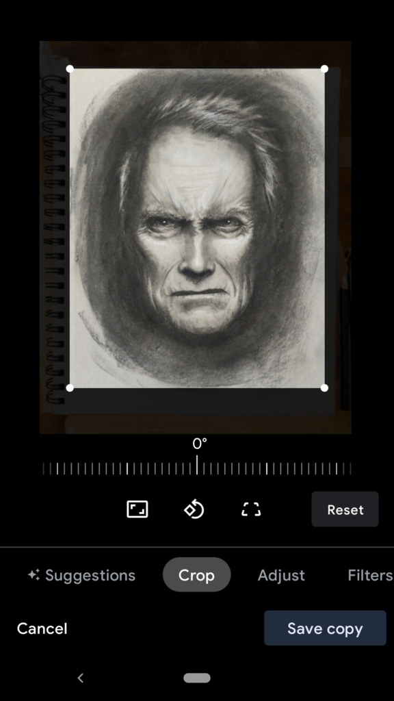
Once the photo is taken, it’s time to crop out what you don’t need. The best way is to align the cropping square as close to the dimensions of your paper as possible. If you notice the image is slightly crooked, now is your second chance to straighten it out using the rotation slider.
If your art is small on the page, don’t be afraid to crop in closer. Just be sure to leave some padding around the subject so it doesn’t look you’re cropping something else out.
👉 Quick tip: turn your screen brightness all the way up when photographing art. That way you won’t be compensating for a dim display when you make your edits later.
4. Adjust the white levels
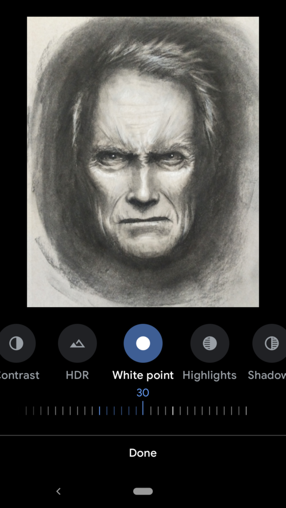
When you photograph a blank piece of paper or canvas, the digital camera on your phone works very hard not to overexpose the image. Overexposure means that areas become pure white and no longer retain any color information.
The problem is that the camera will then darken the white levels slightly to compensate for the bright paper. The result? Dingy and grayish looking paper.
The solution is to adjust the white levels up by around 10-50%. This lightens up the image and increases contrast while keeping the darker shades and midtones intact.
On Android this is done with the white point tool. On iOS a combination of highlights and brightness adjustments should do it.
Inversely, lowering the shadows or black point can also help the picture look more true-to-life.
5. Check saturation and color balance
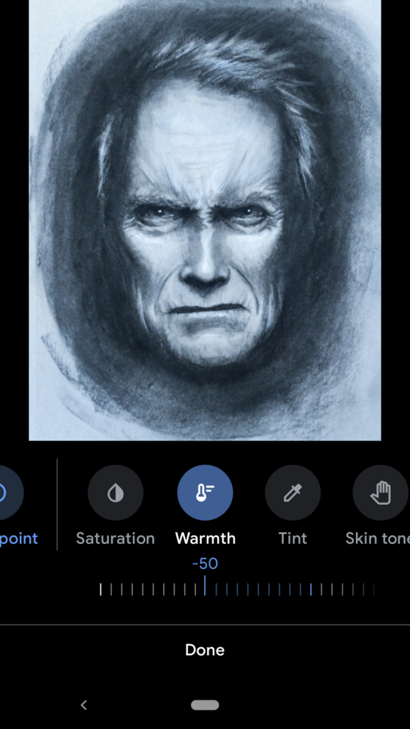
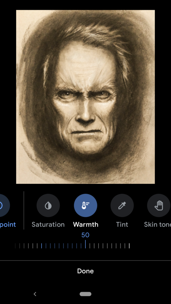
If you’re photographing a painting or other full color piece, having accurate color balance and saturation is hugely important. Color balance refers to the overall hues mixed into each pixel of the image. Depending on your original light source, you might have warmer (more yellow hues) or cooler (more blue hues) in your picture.
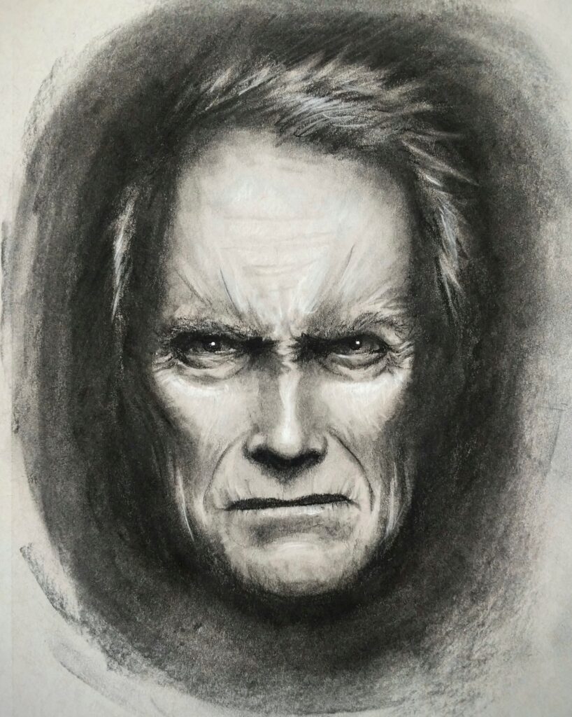
Your color balance should reflect the actual spectrum of colors you painted with, so you’ll want to adjust this to be as neutral as possible. Moving the warmth slider will help correct this.
Also important is the saturation, or intensity of the colors on screen. If your photo looks a little washed out compared to the source, ticking the saturation levels up a few notches usually remedies this.
A word about photo filters
The goal of the steps outlined above has been to create a photo that best represents the actual piece of art. Adjusting values that were already part of the picture means nothing was added or removed from the original image.
Filtering a photo on the other hand goes a step further. By overlaying color layers, cranking hues, removing blemishes and many other options, the picture can no longer be said to represent the original art. It has been altered beyond what was captured in reality.
How far you take your edits is up to you, but here’s our advice… always keep a copy of the original.